Noisy Notifications @ Expel
UX Research + Facilitation
What is Expel?
Expel is a cybersecurity SaaS helping enterprise customers with managed detection & response.
As the UX Designer on the Notifications team, I was focused on designing ways for customers to react quickly to critical threats and increase visibility into their environment to improve their security posture.
PROBLEM 🚨
Customers are sharing feedback that their notifications are noisy. This leads to cognitive overload, which can lead to our customers missing critical notifications which puts their cybersecurity posture at risk.
GOAL 🎯
We want to understand what they define as noisy, why they feel this way by exploring specific scenarios, and generate some actions we could take to improve this issue which can increase our NPS score.
APPROACH 🔎
STEP 1: Define research plan and interview questions

Check out the research plan in more detail. 👀

Interview strategy
During my interviews, I use Wendy Sullivan’s “Clean Language” to discover more specific insights without using leading questions that can result in bias.
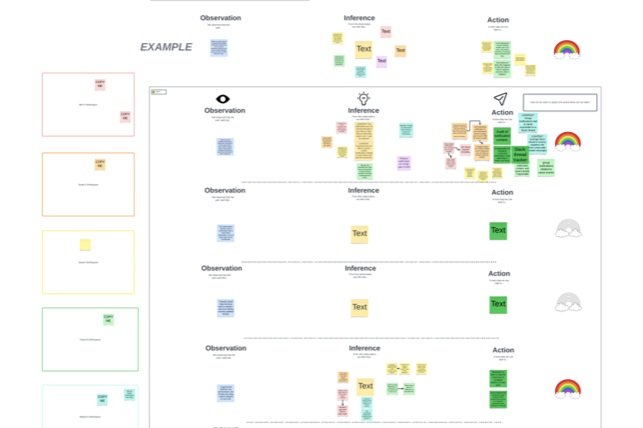
STEP 2: Share insights in an interactive way
↪Why? So that I can involve my engineering and product collaborators in an active way to build empathy and establish alignment.
↪How? I facilitated an adaptation of the Rainbow Spreadsheet Exercise with my entire product team.

First, an icebreaker to get us all connected.

Next, workshop time!
1st, we watched real clips of customer insights.
2nd, we all shared what we can infer from this insight.
3rd, we shared actions we could take.

Impact:
Through this interactive exercise, not only did we see where there was alignment on what we can improve, but we also were able to extract other engineering insights that I wouldn’t have been able to gather by simply presenting this research.
It was also fun for the group and brought our team closer together and able to empathize more directly with customer challenges.
STEP 3: Develop design principles
To support future development of the notifications experience, I created clear design principles for our team to stand by.

Design principles helped to establish a deeper understanding around why we make certain decisions as a team on behalf of the user and how these principle have a positive impact the user.