
Conversion @ HelloAva
UX Research + UI | B2C
This project highlights—
User research
Information architecture
Low-to-high fidelity UI prototyping
User testing
What is HelloAva?
We use AI and machine learning to provide consumers with highly accurate, personalized skincare recommendations and products.
Problem Space
After a Pandemic boom in the skincare industry, the number of prospective users that convert to the paid package was stagnant.
Assumption
Users that take the HelloAva Skincare Quiz are uncertain about what value they will be getting by selecting a paid package.
Users desire a reward for completing the skincare quiz and registering an account before deciding to select a paid package and have access to our service.
How might we…
inspire our users with personalized knowledge based on their quiz responses so that they feel confident in paying for our service?
give the user more transparency and confidence on what they will be getting by converting to a paid user?
Hypothesis
If users get to see a sneak peek of some personalized skincare knowledge, they will have more confidence to pay for our service and try out their product recommendations.

Goal?
Increase conversion by 5% over two months.
UX Research


Strategize.
I created a research plan to hone in exactly the types of users we want to speak with and clarify what we want to understand in our interviews.

Investigate.
I helped schedule and run 5 user interviews, with consolidated user insights to summarize key takeaways to present to the entire HelloAva team.

Narrowing down.
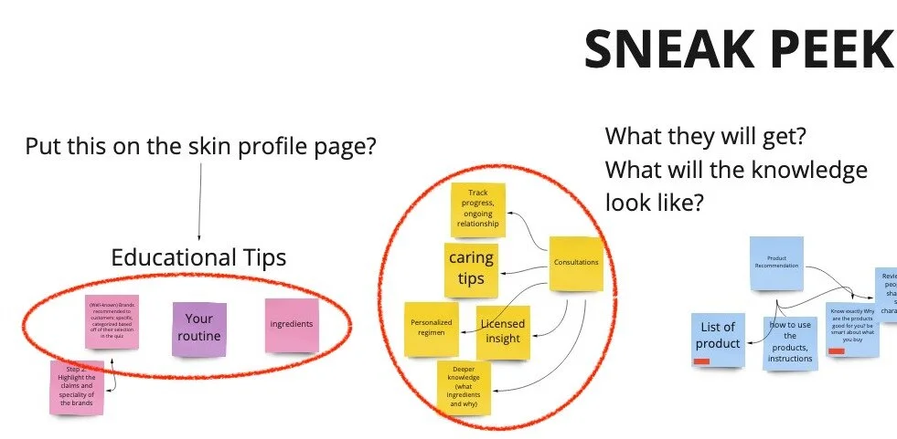
Through a facilitated discovery session with the product team, I identified aspects that users mentioned would be valuable to them in order to prioritize feature elements for the sneak peek page.
Organize.
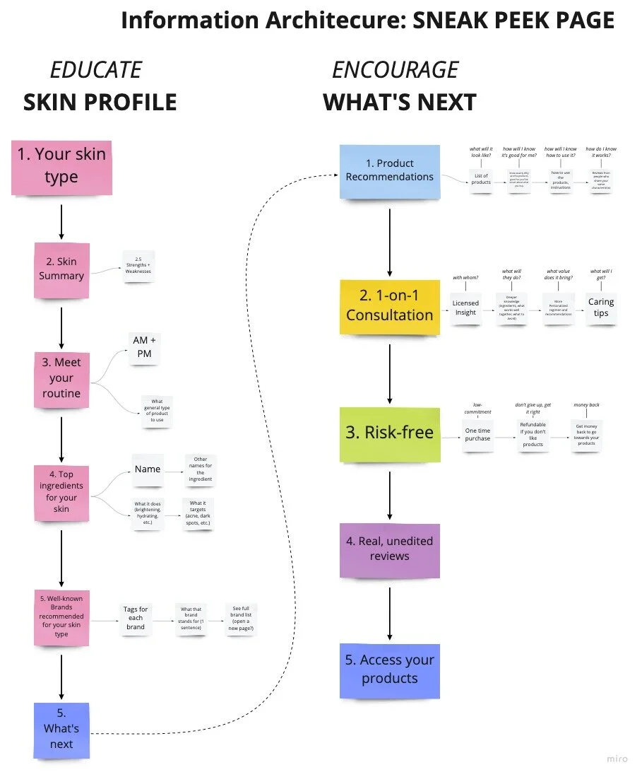
In order to better understand the flow of information leading up to the user selecting a payment package, I consolidated the feature elements using information architecture before creating wireframes.

Wireframing and prototyping.
Alongside the Chief Creative Officer, I built out a Sneak Peek Page to get more personalized knowledge about the best ingredients for their unique skin type, a step-by-step routine, and recommended brands following the quiz before the esthetician’s follow-up with the customer.
From there, the user would be able to visually understand the value they would receive once converting to a paying customer.
Wireframes: Skin Profile

Skin Type
First, we tested out where information on your skin type and needs lives on the screen.

Routine
We experimented with how a personalized routine appears.
Wireframes: What’s Next?

What you get
We experimented with the horizontal scroll to shorten vertical scroll length.

How it works
We also looked at vertical scrolling with visuals.
We completed our first prototype of this “Sneak Peak” feature to test on users.

Sneak Peek Screen #1
Skin Profile 2.0

Sneak Peek Screen #2
What’s Next 2.0

User Testing.
I helped schedule and run 5 user tests to get feedback on the first prototype of the “Sneak Peek Page” and “What’s Next Page”.
My main focus was having the user talk through what they are seeing, what initial reactions they have along the way, and observing their behavior to assess for confusing UI or oversaturated content.
And lo and behold, we honed in on our final prototype.
👍 100% of users we tested communicated that they would definitely pay for the service after seeing these pages, and felt very confident that they would see value in converting into a paid customer.

The outcome?
After a few rounds of QA, we shipped out this new feature to our users.
We were able to drive up conversion and complete our goal, leading to more paid users onto our platform! 🎉
